
Questions About Shodo, Japanese Calligraphy: ン, ソ, and リ… Wait! They’re different!?
At first glance, the katakana characters ン, ソ, and リ look almost identical. If you’re new to Japanese, you might wonder why on earth we have such confusingly similar shapes. It can feel frustrating!
But those who grew up using Japanese can easily tell them apart. One important reason: they know how to write them correctly.
Stroke Order Matters More Than You Think
In Japan, children are taught proper stroke order from a very young age. Many of them get told again and again—so much that they want to yell, “Why does stroke order matter anyway!?” (My son complained exactly that!)
But stroke order is essential. It’s actually the key to reading characters like ン, ソ, and リ correctly.
Let’s Look Closely at the Differences
ン (n)
The first small stroke begins at the upper left and gently moves down to the right. The second stroke starts from the lower left and sweeps upward to the upper right like a shooting star. Notice how the end of the stroke becomes thinner — this comes from brush technique.
Katakana originally developed from kanji more than 1,000 years ago, when people used brushes to write. The elegant tapering found in the shapes even today still reflects that heritage.
ソ (so)
It looks almost identical to ン — but the stroke direction flips! The second stroke starts from the upper right and moves down to the lower left with a smooth taper at the end.
For both ン and ソ, the longer line curves slightly downward. That subtle sag — as if pulled by gravity — makes the character look more balanced and beautiful.
When handwritten, you can instantly see the difference in brush pressure and direction. That’s how Japanese readers recognize which is which so quickly. Digital fonts keep this distinction too.
リ (ri)
Since リ is also similar, let’s include it here.
Compared with ン and ソ, リ has:
A taller, more vertical look
Two straight vertical strokes
A long second stroke that gently curves left at the end
Like the others, the shorter stroke is written first.
But unlike them, it is just a straight vertical line — simple and clear.
By understanding these structural features, you’ll make fewer reading mistakes and your own handwriting will become more readable too.
Katakana Is Full of Look-Alikes
There are 46 basic katakana characters — and several similar pairs:
ツ & シ
ス & ヌ
ク & ワ
コ & ユ
チ & テ
ノ & レ & ル
…and more!
Take time to observe the stroke directions and imagine the brush movements. Once you get used to them, it becomes surprisingly fun.
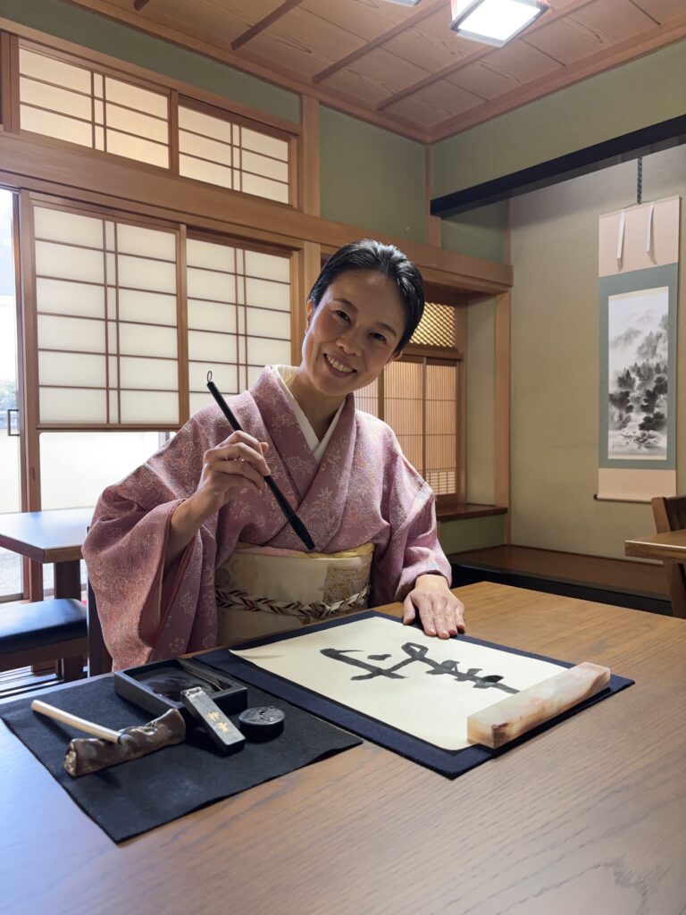
Why not experience the joy of writing with a brush yourself?